Details
-
Improvement
-
Resolution: Fixed
-
 Major
Major
-
1.0
-
None
-
None
-
Unknown
-
Description
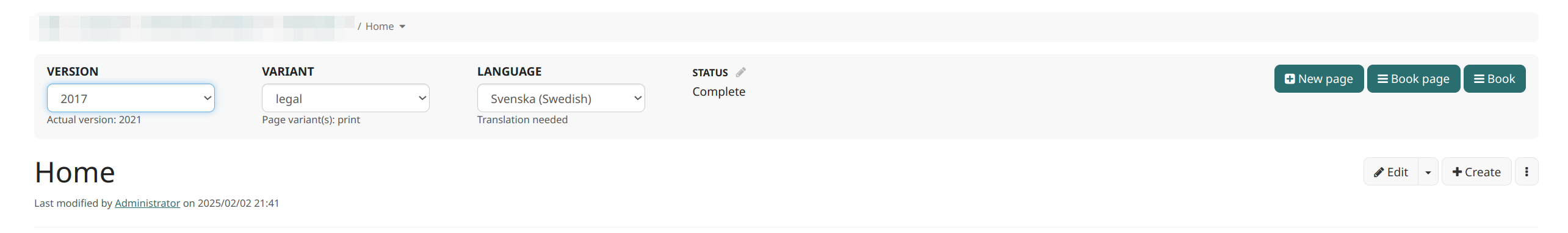
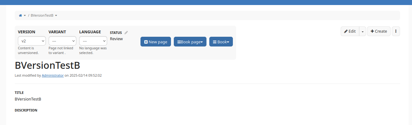
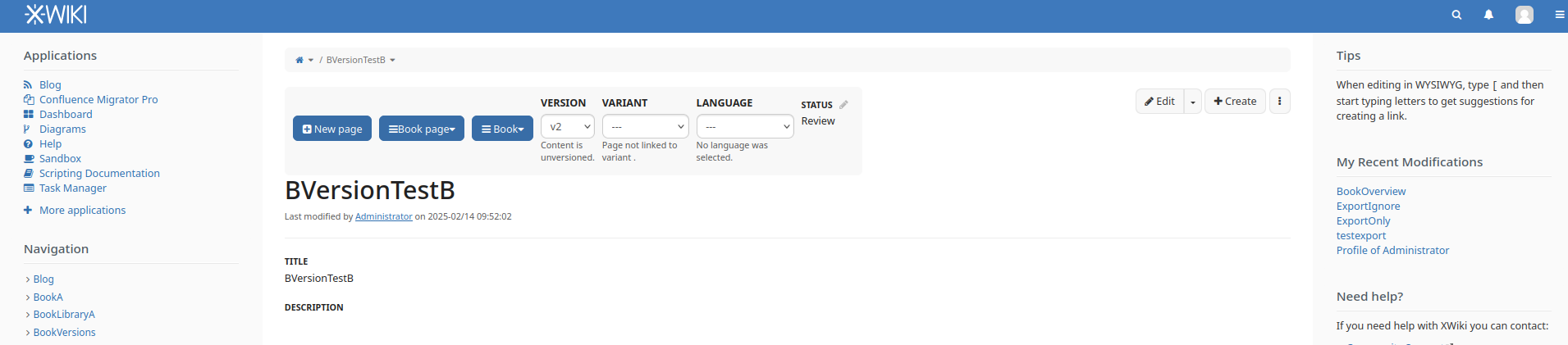
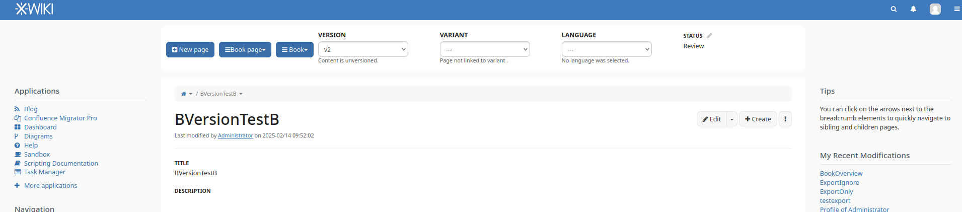
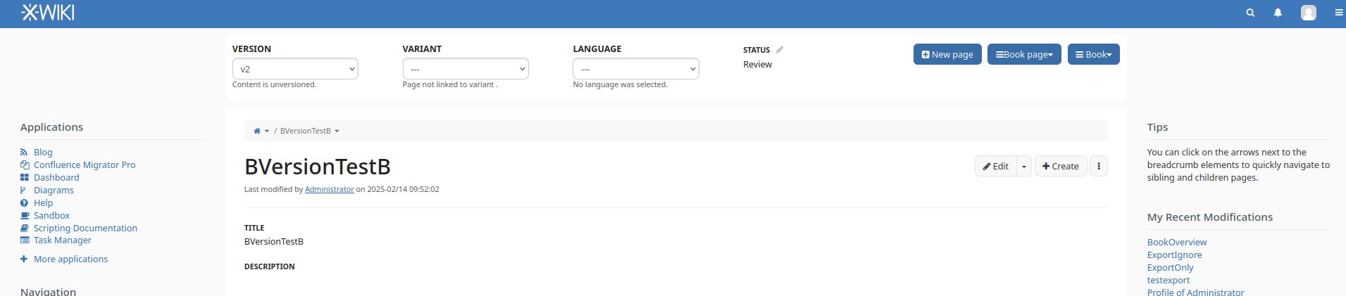
Here is a proposal for a new display of the menu of the Book version menu, with explanations about objectives below:

Principles:
- group all book versions related information in a single ribbon (above the standard XWiki page display)
- ribbon has a colored background so that the group is identified
- the differences between a page that is part of book versions and a page that is not is the presence of this ribbon
- it may not be possible to place the book versions menu where it's put in the screenshot, as there may not be a UIX there. If so, what we priviledge here is the grouping, even if we need to choose another placement)
- separate the buttons on the right into 3:
- content adding button -> New page (same button as today, just displayed elsewhere)
- actions for the current page -> Book page (this contains the options that are currently under Versions menu -> Page actions group)
- actions for the whole book -> Book (this contains the 2 other groups, Manage and Publishing)
- ideally these last 2 buttons should have an arrow displayed next to them, to highlight that they have submenus)
- For the information on the left (version, variant, language, status):
- have:
- an action (the current dropdown + label, because actions need to be named)
- and a description of the currently displayed item: the text under, which could be moved next to the dropdown - to explore
- the description of the currently displayed item should be expressed in the form: "label: value" or just "label", where label is a 1-2 words keyword, not a sentence
- have this text be as short as possible - if it's kept under it should be a single line.
- add a tooltop to the label or to the whole text that explains more in detail the meaning of the label
- we expect users to learn the semantic of the labels from the tooltips as they use the application and not need the tooltip anymore as they will recognize the keyword / label.
- have: