Description
When adding a link to a page and clicking on the button to select the page to link to from the tree the hierarchy will open and auto-open to position to the current page.
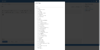
If the tree is too long the dialog with the tree may expand outside the visible screen, in which case the whole screen will scroll not only the dialog content.
I would expect the dialog content to scroll for the tree so that the buttons of the dialog remain always visible on the screen, as it may not be obvious for the user what they need to do to reache the button.
Note that the buttons go out of the visible viewport also when the tree is expanded by the user to reach some pages.
Steps to reproduce:
- on a wiki with lots of pages (e.g. choose to display hidden pages)
- create a link in a wysiwyg editor
- click on the little page icon in the link dialog to see the tree selection screen
- open the tree until the vertical size of the tree is longer than the screen
Actual result:
- the buttons of the tree selector dialog go out of the viewport - see screenshot
Expected result:
- The content of the dialog should have a vertical scroll and have the buttons always visible on the screen
