Details
-
Bug
-
Resolution: Fixed
-
 Major
Major
-
2.0
Description
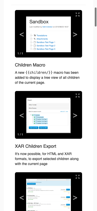
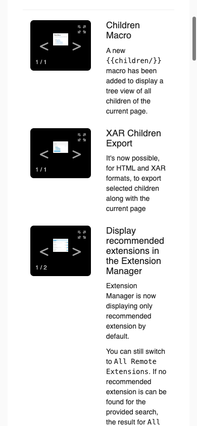
The flow change displayer lays each change out as a two-column row: the change's media on the left, its title and summary on the right. It builds those columns with Bootstrap's col-xs-6, the class that applies at every screen width, so the two columns stay side by side however narrow the screen is instead of stacking on a phone.
The gallery the media column holds asks for 420 pixels. Measured on the demo release notes report (ReleaseNotes.Code.Report with ?action=report&displayer=flow) in a 390-pixel-wide viewport, each column comes out 150 pixels wide and the gallery is squeezed down to 120: the screenshots are unreadable thumbnails, and the summary beside them is a ribbon of text three or four words wide.
The two columns should stack once the media column can no longer hold the screenshot at the width the gallery asks for.