Details
-
Improvement
-
Resolution: Unresolved
-
Minor
-
None
-
1.4
-
None
-
Unknown
-
Description
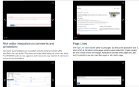
The issue with the Current version is readability.
When there are consecutive changes, the reader separates the entries by the change title, assuming the screenshots is related to the change below and not above.
This can be solved by changing the order, or by improving the styling (more spacing or visual separation of changes).

The screenshots should be displayed after the title:
- Current: {screenshots | video} {title} {description}
- VAR1: {title} {screenshots | video} {description}
- VAR2: {title} {description} {screenshots | video}
See "Changes Report". Example: https://www.xwiki.org/xwiki/bin/view/ReleaseNotes/Code/Report?action=report&displayer=grid&products=XWiki&versions=12.%25&categories=&audience=&importance=High%2CMedium&containsScreenshots=true