Details
-
Sub-task
-
Resolution: Unresolved
-
Major
-
None
-
1.2
-
None
Description
Implement new functionality: the attending marker, used to display a user's intention to attend a meeting. It has 4 possible values: Yes, Maybe, No and Unselected.
There are 4 areas where the markers are to be displayed:
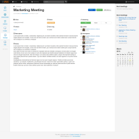
Single meeting | View mode
Area 1: The Attending buttons group, 2nd row, 3rd column.
By default the group of buttons contains the Yes, Mabe and No buttons, out of which none is highlighted. They serve 2 purposes:
a) display the attending status of the currently viewing user
b) allow input in order to change the current attending status
Example: an invited user reviews the meeting details for the first time. By default all the buttons have the same background. Should the user decide the attend the meeting, pushing the [Yes] button would highlight the selection using a green background and register the option in the database, specifically for that user. Upon the next visit the Yes option would be already highlighted. However the system would still alow for a status change should the user decide to make a change.
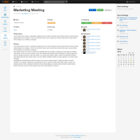
Area 2: the Leader and Participants blocks, 3rd and 4th row, 3rd column
Each user listed would receive a marker before their respective row showing the status of their attendance intention, as follows:
Yes - green checkmark
Maybe - orange question mark
No - red x mark
Unselected - no mark at all
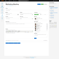
Single meeting | Edit mode
Area 1: the Attending buttons group, 1st row, 3rd column.
The buttons group functionality is replaced by a drop down selector with the 4 possbile states as options.
Area 2: the Leader and Participants blocks, 2nd and 3rd row, 3rd column
Same functionality as Area 2 from te View mode.
Details:
Based on user profile, the Attending group buttons behave as such:
Guest user - displayed in default view but with a grey, disabled style
Logged in user, not invited - same as guest
Logged in user, invited - main functionality and interaction, as described above
Logged in user, meeting creator - main functionality and interaction, as described above
Logged in user, wiki admin - main functionality and interaction, as described above
The colors used to highlight the selections are as follows;
Yes - green
Maybe - orange
No - red
Make use of the Flamingo/Bootstrap styles to achieve the proper colors and UI effects.


