Details
-
Sub-task
-
Resolution: Fixed
-
Major
-
1.2
-
None
-
Pull Request accepted
-
Description
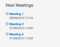
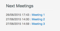
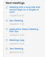
Improve the Next Meetings panel as per screenshot
Display
Notice the bullets that visually mark each item in the list, the link on the meeting title which can span on multiple rows and do not share any row with the meta datas: date and time of the meeting
Functionality
List items are maximum 5 and are displayed descending: from the closest meeting to the fathert one on the time axis
Details
Ideally we should improve the panel or create a dedicated panel that would display only the meetings where the current viewing user has been invited, currently all of the upcoming meetings being displayed (no matter if the current user has been invited).


