Details
-
Improvement
-
Resolution: Fixed
-
Major
-
1.0.5
-
None
Description
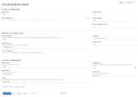
The current sheet shows all the properties of the app, vertically. As we are adding some new props, the user has to scroll and the full page isn't used to display every property.
The goal of this issue is to make the configuration page a tiny bit more user friendly, by creating categories of properties and organizing them to use the full page space.
