Details
-
Improvement
-
Resolution: Unresolved
-
 Major
-
None
-
Unknown
-
Description
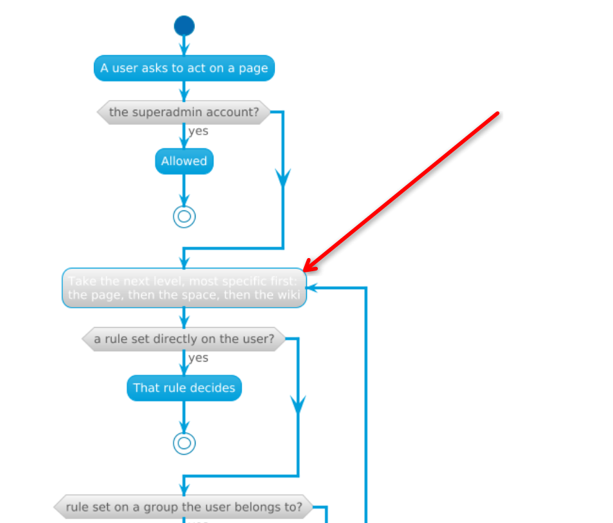
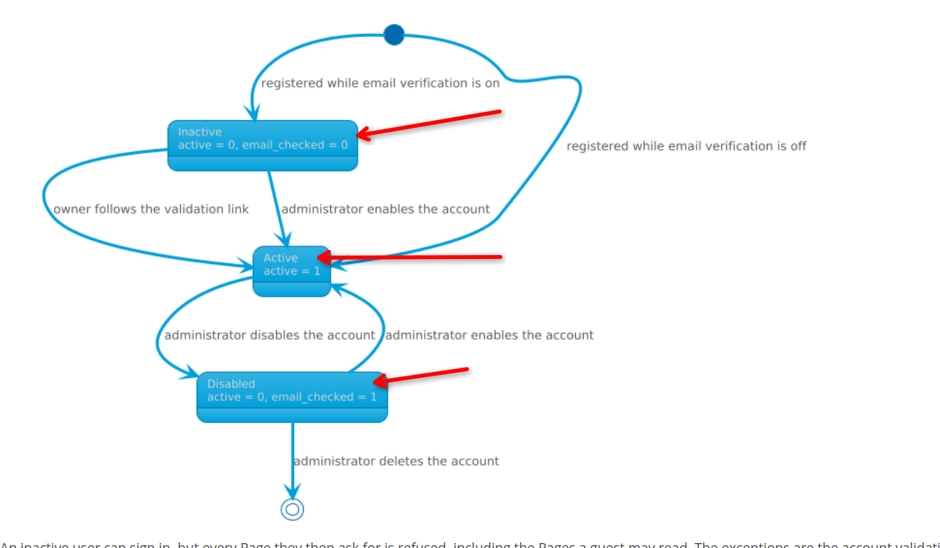
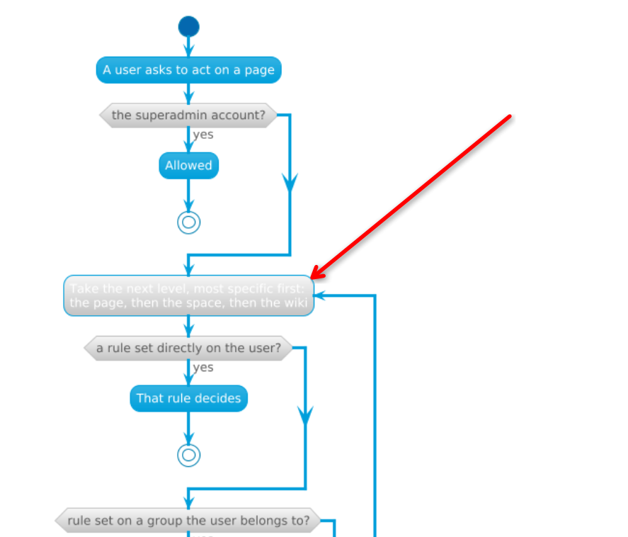
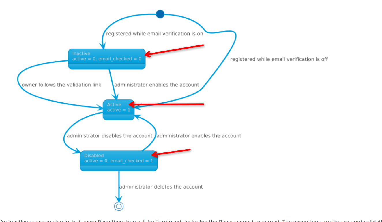
I don't know if this is an automated thing that can be fixed by improving the automation or manual, but there are at least 2 diagrams with areas that are not readable (for me). I don't have any known visual difficulty, so this is an important problem. I suppose the rest of the colors of the diagrams should be reviewed for contrast for the objective of full accessibility (e.g. I saw some black on grey and also for the standard white on blue, I have a couple of doubts).
Here are the examples I found:
- https://www.xwiki.org/xwiki/bin/view/documentation/xs/admin/rights/rights-resolution/
- https://www.xwiki.org/xwiki/bin/view/documentation/xs/admin/user/inactive-users/