Uploaded image for project: 'XWiki Platform'
  1. XWiki Platform
  2. XWIKI-12462

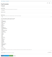
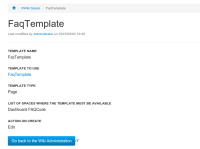
Hard to tell which label goes with which field when viewing or editing template providers

    XMLWordPrintable

Details

    • Improvement
    • Resolution: Duplicate
    • Minor
    • None
    • 7.1.2
    • Administration
    • None
    • Arch Linux
    • Trivial

    Description

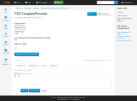
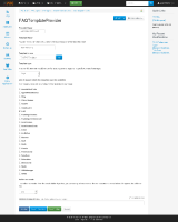
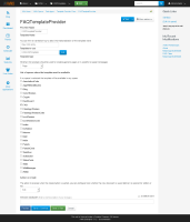
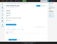
      The Flamingo themes currently put 20px of margin on <dl> elements. This whitespace actually makes editing a template provider more confusing. It would make more sense to put the margins on <dd> elements instead (open the attached before-and-after screenshots to see how this would look).

      Attachments

        1. view - margin on dl.png
          view - margin on dl.png
          43 kB
        2. edit - margin on dd.png
          edit - margin on dd.png
          63 kB
        3. edit - margin on dl.png
          edit - margin on dl.png
          62 kB
        4. view - margin on dd.png
          view - margin on dd.png
          43 kB
        5. afterEdit.png
          afterEdit.png
          136 kB
        6. afterView.png
          afterView.png
          32 kB

        Issue Links

          Activity

            People

              gabriela.smeria Gabriela Smeria
              alex.henrie Alex Henrie
              Votes:
              0 Vote for this issue
              Watchers:
              3 Start watching this issue

              Dates

                Created:
                Updated:
                Resolved: