Uploaded image for project: 'XWiki Platform'
  1. XWiki Platform
  2. XWIKI-14978

Add an entry in the Alert menu to explain what it's for

Details

    • Improvement
    • Resolution: Unresolved
    • Major
    • None
    • 9.11.1
    • Notifications
    • Unknown

    Description

      Right now users won't know easily what the Alert menu is for. It would be nice and helpful that we add an entry in this menu (with the ability for Admin users to remove it by clicking some X or "Dismiss" button) and that will explain what users should be able to see in this menu and how to use it.

      It would also add the red count to 1 when you log in initially, drawing attention to the alert menu so that users can discover it.
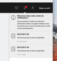
      Something similar to:

      Attachments

        Activity

          [XWIKI-14978] Add an entry in the Alert menu to explain what it's for
          enygma Eduard Moraru added a comment -

          I also believe that an empty "You currently have no notifications" is enough for anybody to understand. When notifications start coming in, it will be even more clarifying and there will also be the red sign, grabbing the user's attention. We don't need to introduce them to features they can't yet use.

          IMO, we should focus on self-explanatory UI, rather than inline documentation that makes the UI unnecessarily heavy and hard to use after the first 5 minutes.

          enygma Eduard Moraru added a comment - I also believe that an empty "You currently have no notifications" is enough for anybody to understand. When notifications start coming in, it will be even more clarifying and there will also be the red sign, grabbing the user's attention. We don't need to introduce them to features they can't yet use. IMO, we should focus on self-explanatory UI, rather than inline documentation that makes the UI unnecessarily heavy and hard to use after the first 5 minutes.

          The Bell and the Notificatiosn area are now common in our interfaces, but I don't see no reason why we would not have this initial notification entry, describing the purpose.
          With the comment that, now, since the feature is "new" this seems like an interesting idea, but after a while it might become disrupting if we add this kind of dismissable help hints for multiple features. Users might need to go to every feature and close the help entry for all / each time they reinstall, etc.

          Still, the hardest part of having this help entry is the implementation. Since it would need to have a "sticky" mechanism that sticks to the top until it is dissmissed. We might want to have this mechanism also when "announcing" upgrades, new versions, read-only mode, flavor license expiration, or other things.

          Another note, this help entry does not replace the "blank state" for notifications. After the entry is dissmissed, the user will still see "No notifications" message.

          evalica Ecaterina Moraru (Valica) added a comment - The Bell and the Notificatiosn area are now common in our interfaces, but I don't see no reason why we would not have this initial notification entry, describing the purpose. With the comment that, now, since the feature is "new" this seems like an interesting idea, but after a while it might become disrupting if we add this kind of dismissable help hints for multiple features. Users might need to go to every feature and close the help entry for all / each time they reinstall, etc. Still, the hardest part of having this help entry is the implementation. Since it would need to have a "sticky" mechanism that sticks to the top until it is dissmissed. We might want to have this mechanism also when "announcing" upgrades, new versions, read-only mode, flavor license expiration, or other things. Another note, this help entry does not replace the "blank state" for notifications. After the entry is dissmissed, the user will still see "No notifications" message.
          vmassol Vincent Massol added a comment -

          But In my opinion, the UI should be clear enough so user don't have to read anything to understand how it works. I may expect too much...

          I really don't see the problem to explain things if they don't come in the way (which is the case here).

          Moreover, I would expect the Tour to show this feature instead of having a new "mechanism" for that. WDYT

          Most people don't use the tour. It's painful and not useful when you're not ready. It's way better to be able to learn about a feature when you want to discover it and have the tour push 20 concepts on you in the first 2 minutes of usage of XWiki.

          So I would see it the other way: the tour shouldn't be needed at all ideally. Each feature should be discoverable and understandable. This entry in the alert menu makes the feature understandable and discoverable (thanks to the red number 1 in the menu).

          vmassol Vincent Massol added a comment - But In my opinion, the UI should be clear enough so user don't have to read anything to understand how it works. I may expect too much... I really don't see the problem to explain things if they don't come in the way (which is the case here). Moreover, I would expect the Tour to show this feature instead of having a new "mechanism" for that. WDYT Most people don't use the tour. It's painful and not useful when you're not ready. It's way better to be able to learn about a feature when you want to discover it and have the tour push 20 concepts on you in the first 2 minutes of usage of XWiki. So I would see it the other way: the tour shouldn't be needed at all ideally. Each feature should be discoverable and understandable. This entry in the alert menu makes the feature understandable and discoverable (thanks to the red number 1 in the menu).

          I have mixed feelings about it.

          My first impression was: "nice, it's informative and in-context". But In my opinion, the UI should be clear enough so user don't have to read anything to understand how it works. I may expect too much...

          Moreover, I would expect the Tour to show this feature instead of having a new "mechanism" for that. WDYT, evalica?

          gdelhumeau Guillaume Delhumeau added a comment - I have mixed feelings about it. My first impression was: "nice, it's informative and in-context". But In my opinion, the UI should be clear enough so user don't have to read anything to understand how it works. I may expect too much... Moreover, I would expect the Tour to show this feature instead of having a new "mechanism" for that. WDYT, evalica ?

          People

            Unassigned Unassigned
            vmassol Vincent Massol
            Votes:
            0 Vote for this issue
            Watchers:
            4 Start watching this issue

            Dates

              Created:
              Updated: