Details
-
Improvement
-
Resolution: Fixed
-
Major
-
12.10.2
-
Integration
-
Unknown
-
https://extensions.xwiki.org/xwiki/bin/view/Extension/Extension Manager Application
-
Description
First version done in XWIKI-17634.
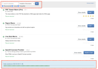
I believe this requires some UI tuning. Specifically to address these points:
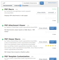
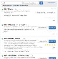
- The UI looks weird (the sizes of locations of the checkboxes look strange in regards to the existing inputs).
- There's too much shown on the screen by default making the UI a lot more complex than before for the admin user. They also now need to understand the concept of "indexed" (which is not even explained and looks very technical, I'm not even sure that admin need to care about this), "recommended" and "compatible".
A proposal is to move all these under some advanced configuration, such as the "advanced search" link that already exists and that is a bit of a misnomer. So one idea is to regroup everything advanced under it to make the UI more clean and simpler by default (by default users want to see compatible, recommended and probably indexed - whatever that means, I don't understand it myself).
Also that "advanced search" UI should explain (tooltip or better a displayed hint as we use in configuration UIs) the concepts of indexed, recommended and compatible.
Attachments
Issue Links
- is related to
-
XWIKI-17634 Solr based local extension index
-
- Closed
-
