Details
-
New Feature
-
Resolution: Unresolved
-
Major
-
None
-
13.4.5
-
None
-
Unknown
-
Description
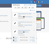
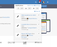
Currently, the only place where a user can see and their notifications on the UI of the wiki is the popup under the bell icon, for example:
Multiple features are crammed in this small space:
- seeing a potentially long flow of notifications (not the case in the above screenshot, but can be the case) - a scroll will be added
- all the information about each notification: basic ones and expanded details, with links that can navigate away from the current view:

- actions for notifications:
- "mark as read" button for each notification,
- the clear all button on top of the list.
- access to settings,
- link to RSS,
- the switches with actions for the current location .
There should be view for the notifications of a user in a separate screen / page, displayed on the full width of the page where all these actions would be comfortably accessible.
This would be like an "inbox view", where a user can go to read and organize their notifications - not the notification preferences, the notifications themselves as messages.
Github has a similar thing, they actually only display the count in the bell area in the menu bar, clicking on it links directly to the 'inbox view'.

Gitlab also seems to have the same now, no more display at all on the bar, direct link to inbox view.
I don't think we need to remove the display in the popup, but the popup under the bell would be more like a summary / quick view of that page, with a link to the page.
