Details
-
Bug
-
Resolution: Fixed
-
Minor
-
15.3-rc-1
-
Unknown
-
N/A
-
N/A
-
-
Description
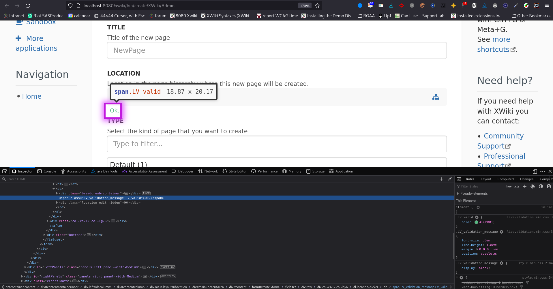
Example found on a create page.
There is not enough contrast between the "Ok" text and its white background.
Contrast should be at least 4.5 to satisfy WCAG 2.1 AA SC 1.4.3: https://www.w3.org/WAI/WCAG21/Understanding/contrast-minimum.html .
https://forum.xwiki.org/t/fixing-a11y-contrast-issues-on-the-main-view/11917/6
On this forum post, the use is reversed (white on green instead of green on white), but the issue is similar.
There are two possible ways to solve this:
- deem that the color used is semantically inappropriate and change it to another text color that passes contrast limits.
- deem that the color is semantically correct, and change its value to increase the contrast on white (same value as the one chosen in the forum post above is a correct solution)

Attachments
Issue Links
- is related to
-
XWIKI-20974 AWM create application wizard steps lack contrast
-
- Closed
-
- relates to
-
XWIKI-20680 Contrast issues on the default theme (Iceberg)
-
- Closed
-
