Details
-
Bug
-
Resolution: Unresolved
-
Major
-
None
-
14.10.10
-
Unknown
-
Description
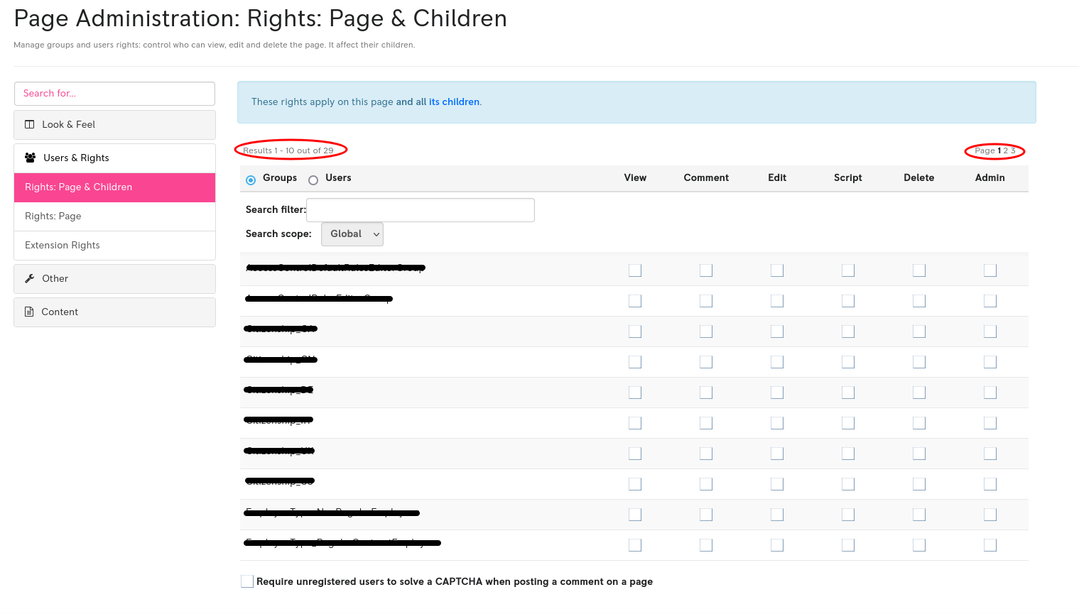
When administering a page rights and more than 10 users or groups are to be displayed, this fact is easy to miss and having to navigate between pages can be a bit dull.
It has confused me (several times) especially when a bit in a rush or tired.

Suggestions to fix this:
- The text I circled in red ("Results : X out of Y" and "Pages : 1 2 3 ...") could be made easier to spot by making it bigger and darker
- The user be able to change this number of users / group per page.
- This default number of 10 could be raised (to 50, or maybe 20?)
- a sentence at the bottom of the table could warn the user about not all elements being shown.
