Details
-
Task
-
Resolution: Fixed
-
Major
-
16.0.0
Description
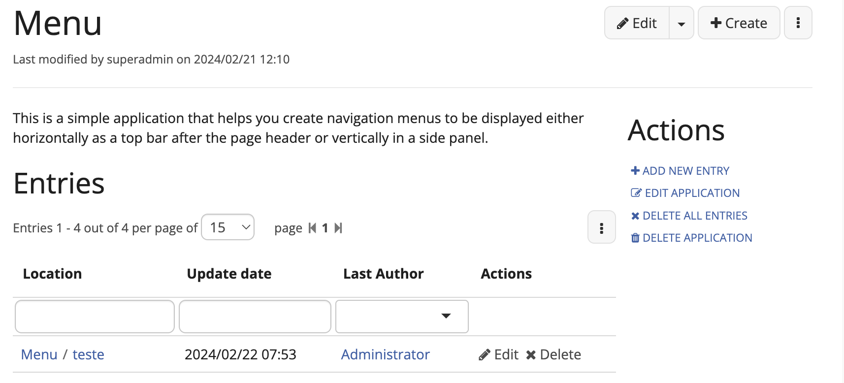
Currently, the layout of app actions is done vertically, leading to unoptimized use of space especially considering that a table is shown below it. For tables the greater the horizontal space available, the better. We also have an inconsistency of icons on both "delete" actions.

