Details
-
Task
-
Resolution: Fixed
-
Major
-
16.6.0
Description
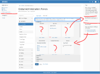
It is not clear first hand how to use this screen. There's a lot of text, and the user can eventually get its use. But we can do better marking what can be dragged and where.
There's also no way (that I know of) to configure these panels without using the mouse, so this would be an accessibility issue.
Shortcuts to panel configurations would also be nice. Example: link the Applications panel config from this screen. This way we can prevent a lot of back and forth from Admin users.
The UI is also very dated and can get a visual design pass.
