Details
-
Bug
-
Resolution: Fixed
-
 Major
Major
-
17.10.3
-
Unknown
-
N/A
-
N/A
-
Description
Problem:
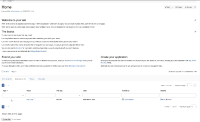
- The current selected page is now displayed with a big blue button which makes it way too visible vs other elements in the page. For ex:
 vs what we had before:
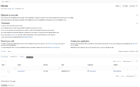
- This is just a status and not a call to action. We normally use the blue color for primary buttons in the UI, ie very important buttons.
- This change was done in a LTS bug fix version, the worst possible time. A bugfix release is for bugs, we need to try to not do UI changes in bugfix versions or at least they need to be discussed thoroughly before being applied.

I've discussed with tkrieck, who agrees to do a new proposal to fix this.
The idea is that we still need to make it more clear what is the current page selected but not too visible either (e.g. using an underline, using a small light grey box, etc).
We need to do this in 17.10.4 since we've now caused an important UI regression in a LTS.
Attachments
Issue Links
- causes
-
-

- Closed
-
- is caused by
-
-
- Closed
-