Details
-
Bug
-
Resolution: Unresolved
-
 Minor
Minor
-
None
-
18.3.0-rc-1
-
None
-
Unknown
-
Description
It's like this because both the radio button and the input need to have a label for accessibility to follow accessibility specifications, but it makes it look very weird.
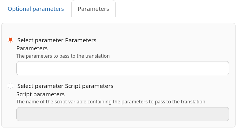
Maybe the second one should be hidden.
