Details
-
Improvement
-
Resolution: Duplicate
-
Major
-
None
-
2.0
-
None
-
N/A
-
N/A
-
Description
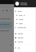
When in multilingual mode, the position of the language links in the header is not very optimal. It increase the height of the header while not bringing too much being on a new line.
See attached screenshot.
I think they would fit better on the left side of the search box or on the very top header, left of the user name.
Attachments
Issue Links
- is related to
-
XWIKI-6402 Separate Interface language and page language settings.
-
- Open
-

