Details
-
Improvement
-
Resolution: Fixed
-
Major
-
4.0-milestone-1
-
None
-
Unknown
-
N/A
-
N/A
-
Description
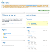
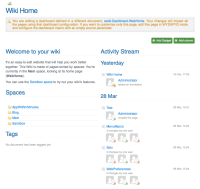
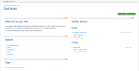
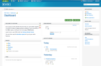
Our dashboard is much nicer than other dashboards because is focused on the content and not on the independence of its elements. This means that you can combine gadgets in order to create a content page that is unified, and you are not just displaying together different/independent elements.
That's why in view mode is important that the gadgets are mixed together and are invisible.
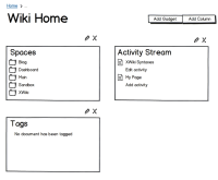
When you edit the dashboard it's another story. The gadgets should be easy to be identified since they have independent settings.
In 3.0 when we introduced the Dashboard we had a 'panels' style for the dashboard container. The difference from that approach is:
- the additional style is available just in INLINE mode
- the title is inside the content so that we preserve the WYSIWYG feeling
- macro's 'cog' icon and heading is visible in order to delimit the gadget. Helps delimitation, dragging, spotting of the settings entry
Attachments
Issue Links
- blocks
-
XWIKI-7685 Improve Homepage editing and Dashboard 'included' message
-
- Closed
-
- is related to
-
XWIKI-6115 Include instructions on how to drag and drop gadgets.
-
- Open
-
- relates to
-
XWIKI-7995 Panel style parameter does not have gradients
-
- Closed
-
