Details
-
Improvement
-
Resolution: Won't Fix
-
Major
-
None
-
6.0.1
-
None
-
Easy
-
Description
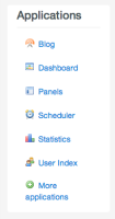
it's not good to make the position absolute on the image icon and the margin to center the image because you can't center it very well, i propose this improvement:
.nav-stacked>li {
float: none;
text-align: center; /* Add this line*/
}
delete the position absolute here
.applicationsPanel ul li img {
/* position: absolute; delete the position absolute*/
margin: 20px 0 0 0; /*delet the margin left*/
}
and change the padding top on
.applicationsPanel ul li a {
display: block;
font-size: 12px;
font-weight: bold;
padding-bottom: 10px;
padding-top: 0px;  /* change the padding top*/
text-align: center;
text-decoration: none;
}
with this, we have a very good result with a compatibility on all web navigator
Attachments
Issue Links
- is related to
-
XWIKI-10487 Improve the text-alignment of the application bar in Flamingo
-
- Closed
-


