Uploaded image for project: 'XWiki Platform'
  1. XWiki Platform
  2. XWIKI-10449

Improve navigation and learnability of Flamingo menu

Details

    • Improvement
    • Resolution: Fixed
    • Major
    • 6.1
    • 6.1-milestone-1
    • Flamingo Skin
    • None
    • Unknown
    • N/A

    Description

      There 2 major problems with the Flamingo menu:

      A. Navigation downgrade

      • In Colibri the menus played 2 roles: dropdowns and links. You could easily access the submenu for the space, while also clicking and navigating to that particular space.
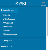
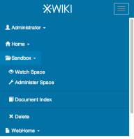
      • In Flamingo this is not possible since the menus are activated on 'click' and not 'hover'. This is better from a mobile accessibility perspective, but could put problems on users accustomed to the old way of working.
      • In Flamingo it is still possible to navigate if using the mouse's middle click, but this functionality has discoverability issues.

      B. Learnability

      • For normal users, seeing that Main is marked as a SPACE, and WebHome as a PAGE, increased learnability of the wiki concepts.
      • In Flamingo these markers are not available anymore.
      • There is XWIKI-9440 . While I agree in theory with it since Page is more common as an action than Wiki, removing also the hierarchy could increase learnability curse.

      A solution would be to add the 'Wiki/Space/Page' markers and maybe divide the navigation and menus between markers - name.

      Attachments

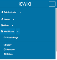
        1. after_mobile.png
          after_mobile.png
          25 kB
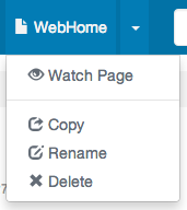
        2. after.png
          after.png
          15 kB
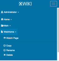
        3. before_mobile.png
          before_mobile.png
          25 kB
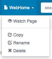
        4. before.png
          before.png
          16 kB
        5. btn-group.png
          btn-group.png
          32 kB
        6. Colibri.png
          Colibri.png
          15 kB
        7. Flamingo.png
          Flamingo.png
          10 kB
        8. sol1_hover.png
          sol1_hover.png
          17 kB
        9. sol1_mobile.png
          sol1_mobile.png
          27 kB
        10. sol2_hover.png
          sol2_hover.png
          17 kB
        11. sol2_mobileproblem.png
          sol2_mobileproblem.png
          27 kB

        Issue Links

          Activity

            [XWIKI-10449] Improve navigation and learnability of Flamingo menu

            Regarding B. point of this issue, the Type: Wiki, Space, Page are found on the entry title.

            evalica Ecaterina Moraru (Valica) added a comment - Regarding B. point of this issue, the Type: Wiki, Space, Page are found on the entry title.

            Writing this kind of '2 seconds' behavior means writing something custom, on top of Bootstrap. Right now we don't plan that.

            evalica Ecaterina Moraru (Valica) added a comment - Writing this kind of '2 seconds' behavior means writing something custom, on top of Bootstrap. Right now we don't plan that.
            Pbas Pascal BASTIEN added a comment -

            No, thxs to you ... and sorry about the mess
            For prob2, on mobile perhaps you have a way to drop down the menu if user press 2 secondes on button?

            Pbas Pascal BASTIEN added a comment - No, thxs to you ... and sorry about the mess For prob2, on mobile perhaps you have a way to drop down the menu if user press 2 secondes on button?

            The committed code is an adaptation of Pascal's solution. Thanks Pascal.

            evalica Ecaterina Moraru (Valica) added a comment - The committed code is an adaptation of Pascal's solution. Thanks Pascal.

            Done in 12e03848f0de2d6b44757c10b30e2b74caacb9a6

            Chosen Sol1 with the dropdown on the caret since users are used to click on arrows in order to expand the menus.

            The padding of the menu caret is similar to the one from 'Edit' button dropdown.

            We should test this solution in 6.1 and see if we want to improve something on it.

            evalica Ecaterina Moraru (Valica) added a comment - Done in 12e03848f0de2d6b44757c10b30e2b74caacb9a6 Chosen Sol1 with the dropdown on the caret since users are used to click on arrows in order to expand the menus. The padding of the menu caret is similar to the one from 'Edit' button dropdown. We should test this solution in 6.1 and see if we want to improve something on it.

            Sol1: So Pascal's solution is to put the 'dropdown' on the caret.
            Sol2: We could put the navigation on the icon, see sol2_hover.png

            No matter Sol1 or Sol2 we have the following problems:
            Prb1: Overriding Bootstrap's defaults we need to provide custom styling, also for media-queries.
            Prb2: The caret area is small and will be harder for users to use it. Pro is that users are accustomed to click on arrows in order to expand menus.
            Prb3: On mobile devices changing the styling from display:block to display: inline-block has some display issues, see sol2_mobileproblem.png

            evalica Ecaterina Moraru (Valica) added a comment - Sol1: So Pascal's solution is to put the 'dropdown' on the caret. Sol2: We could put the navigation on the icon, see sol2_hover.png No matter Sol1 or Sol2 we have the following problems: Prb1: Overriding Bootstrap's defaults we need to provide custom styling, also for media-queries. Prb2: The caret area is small and will be harder for users to use it. Pro is that users are accustomed to click on arrows in order to expand menus. Prb3: On mobile devices changing the styling from display:block to display: inline-block has some display issues, see sol2_mobileproblem.png
            Pbas Pascal BASTIEN added a comment -

            Hello,
            Here my code about top menu of flamingo skin you talking about with Vincent wednesday.
            https://github.com/xwiki/xwiki-platform/pull/290
            Of course, you must probably adapt my "code".
            Thxs
            Pascal B

            Pbas Pascal BASTIEN added a comment - Hello, Here my code about top menu of flamingo skin you talking about with Vincent wednesday. https://github.com/xwiki/xwiki-platform/pull/290 Of course, you must probably adapt my "code". Thxs Pascal B
            gdelhumeau Guillaume Delhumeau added a comment - - edited

            About B/
            I am not against the idea of adding a marker to explain what the menu is about (wiki/space/page), but in the drop down menu, not directly in the top bar. The reasoning is that it would be too crowded IMO.

            A/ is an issue, indeed.

            gdelhumeau Guillaume Delhumeau added a comment - - edited About B/ I am not against the idea of adding a marker to explain what the menu is about (wiki/space/page), but in the drop down menu, not directly in the top bar. The reasoning is that it would be too crowded IMO. A/ is an issue, indeed.

            Maybe a solution for the menu navigation would be to add support for double-clicking on the menu items (could have also problems and also the discoverability is 0).

            evalica Ecaterina Moraru (Valica) added a comment - Maybe a solution for the menu navigation would be to add support for double-clicking on the menu items (could have also problems and also the discoverability is 0).

            People

              evalica Ecaterina Moraru (Valica)
              evalica Ecaterina Moraru (Valica)
              Votes:
              0 Vote for this issue
              Watchers:
              3 Start watching this issue

              Dates

                Created:
                Updated:
                Resolved: