Details
-
Improvement
-
Resolution: Fixed
-
Major
-
6.3-rc-1
-
None
Description
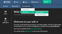
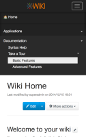
With the new Flamingo skin, the look of the menu application isn't very good:
- The menu bar is right underneath the top bar and they share the same color, so it's not easy to distinguish both
- The text of the menu bar is smaller than the text of the top bar, which isn't very good looking
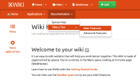
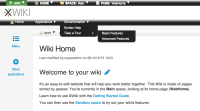
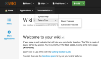
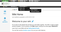
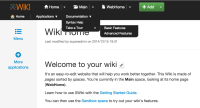
The suggested improvement would be to make the look of the menu application more like how it looks on XWiki.org:
- Different background color for the menu
- Increased height for the menu
- Bigger font size for the menu
- The background color of a menu item on hover should change
I added screenshots to illustrate my suggestions.
Attachments
Issue Links
- depends on
-
XWIKI-10708 Allow LESS syntax in SSX xobjects
-
- Closed
-
-
XWIKI-11374 Be able to use Flamingo Theme variables in Skin Extensions
-
- Closed
-
- relates to
-
XWIKI-11034 Use LESS4J for the implementation of LESSCompiler
-
- Closed
-
