Details
-
Improvement
-
Resolution: Duplicate
-
Major
-
None
-
9.3.1
-
None
-
Unknown
-
Description
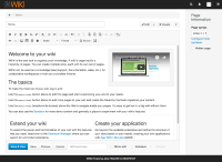
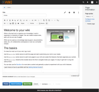
Investigated in http://design.xwiki.org/xwiki/bin/view/Proposal/IdeaVisibleSave
Changes:
- "Save & Continue" renamed to "Save"
- Button order according to survey results https://docs.google.com/forms/d/1DM74hlXQQ22WVdqhYbGWyITWXTH5qgmKSMIrS3eHDKE/edit#responses
- Button grouping
- Summary and Minor Edit moved in the compact area
- Renaming and shortening on Autosave, Summary and Minor options
Attachments
Issue Links
- duplicates
-
XWIKI-14162 Position Save buttons on a fixed-bottom area
-
- Closed
-
- is related to
-
XWIKI-10884 "Version summary" and "Is a minor edit" are looking different on ie10 and Chrome36 than in Firefox31
-
- Open
-
-
XWIKI-10786 The "Autosave" button would look better if centered
-
- Closed
-
- relates to
-
XWIKI-14162 Position Save buttons on a fixed-bottom area
-
- Closed
-

