Details
-
Bug
-
Resolution: Fixed
-
Major
-
8.4.4, 9.3.1
-
None
-
Unknown
-
N/A
-
N/A
-
Description
The confirmation boxes that this issue is about is the confirmation dialog displayed when deleting a comment, for example (see screenshot).
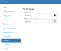
When the background color of panels of the Flamingo color theme is set to black, the box becomes difficult to read, because it's written dark grey on black (see screenshot).
The bug is that it is impossible to fix this from the flamingo theme (of course without writing custom CSS), other than changing the panel background color back to a lighter color.
This is because the background of the confirmation box is set from the panel background color, but the foreground color of the confirmation box is not set from the panel foreground color from the color theme.
Reproduce by setting black panel background color and a light grey for foreground, like in the screenshot -> panels will have proper contrast, while the confirmation boxes won't.


