Details
-
Improvement
-
Resolution: Duplicate
-
Major
-
None
-
6.4.8, 13.10.2
-
None
-
None
-
Unknown
-
Description
Hello,
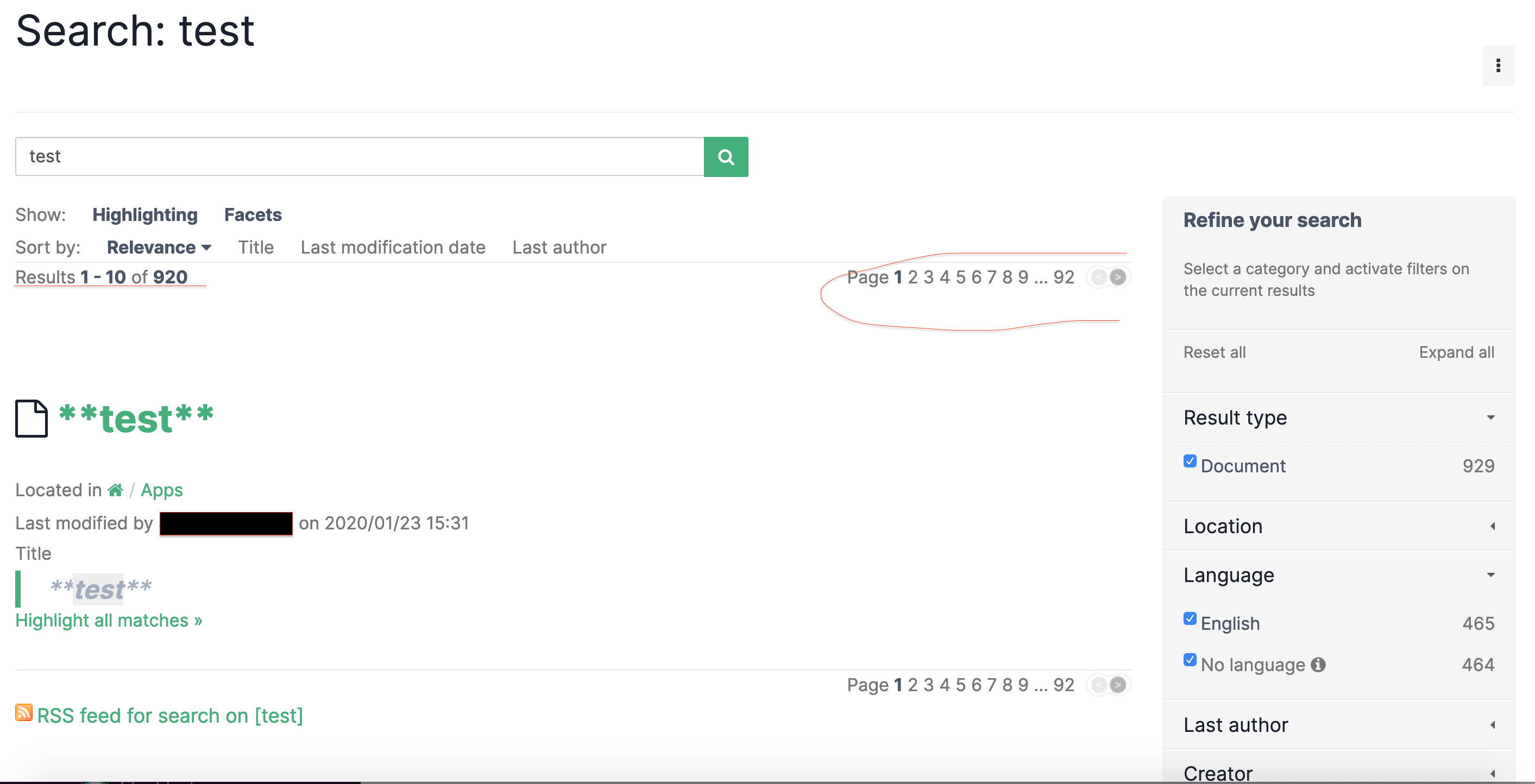
As discussed in a thread opened by me on the forum, the amount of results and page in the XWiki global search is completely irrelevant due to how the right check is performed.
I think global search is a major feature of the wiki and it's not a nice user experience to see "50 results" and "10 pages" but in the end just 1 result. Also there is page with 1 result and maybe the next page have 5 result or none ...
I understand the problematic discussed on the forum of how difficult it is to check XWiki right with solr result and how bad could be the performance.
So I'm suggesting a different UI instead of pagination empty lines and number of result, a "load more" button or "next page" button.
It's the same issue for live table here
https://jira.xwiki.org/browse/XWIKI-9649
And I think the same suggestion "next page" button and no empty line would be great.
You don't need to check permission of 1000 results, just check until you found 11 to display for exemple and return 10 results and next page information. It's a kind of compromise between performance and good user experience, it will be a little slower, but also a really better UX.
There is a risk like in my screenshot to check 920 results and at the end have just 1 accessible document for the user so to check them all for nothing ( it's still better than user iterating 92 pages to found nothing ) in this worst scenario case performance are not good, in that case maybe just check "100" for exemple and still return the next page information to mitigate the issue. It's still not perfect.
It won't be a priority I guess but at least it's in the backlog and maybe some users will vote for it ^^

Attachments
Issue Links
- is related to
-
XWIKI-8583 Correctly handle pagination for Search results that are not viewable by the user
-
- Open
-