Details
-
Sub-task
-
Resolution: Duplicate
-
Major
-
None
-
15.7
-
Unknown
-
Description
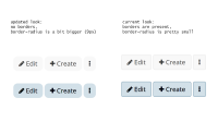
Current XS
Uses borders on all buttons
Updated XS
Change made: Eliminate or make borders on primary buttons less obvious
Motivation:
If the button has the background-color a different colors than the background of the whole page, the button shouldn't have borders.
It creates the visual effect of too many little rectangulars, thus cluttering the UI.
If the button has the same color with the background of the page, its color should be changed to be a bit darker (for light pages) or a bit lighter (for dark pages) color, keeping the idea of no borders on the button.
Attachments
Issue Links
- duplicates
-
XWIKI-21254 Improve the border on buttons
-
- Closed
-
