Details
-
Bug
-
Resolution: Fixed
-
 Major
Major
-
16.10.0
-
None
-
Unknown
-
N/A
-
N/A
-
Description
Steps to reproduce:
- Go to the wiki manager
- Make the browser window small enough to trigger the responsive layout or enable mobile view emulation
- Move the "Membership Type" column up between two other columns
Expected result:
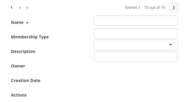
The column names and filters are aligned. The column heights for the first part with the filters are approximately the same as in the actual data.
Actual result:
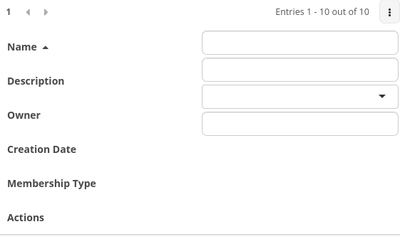
The column names and filters aren't aligned. The column names take a lot more space than the filters and after moving up the "Membership Type" column that has no associated filter, there is only a tiny space for it in the filters column:

With "Membership Type" moved up:

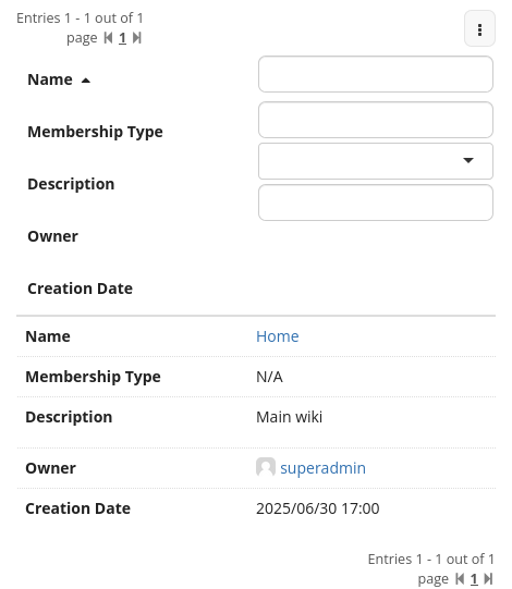
Here on 16.10.9 with the full content to show the difference in row height: