Details
-
Improvement
-
Resolution: Fixed
-
Major
-
7.2-milestone-3
Description
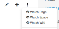
Currently, we have 3 icons in the more actions menu of a page.
Problem:
- it's too cluttered
- all actions in the "more actions" menu are related to the current page, except "watch wiki" and "watch space". We should put them in an other place (maybe in the drawer)
- the 'space' should not be presented in the UI
Attachments
Issue Links
- depends on
-
XWIKI-12756 Introduce a notifications menu
-
- Closed
-
- relates to
-
XWIKI-12846 Adapt Watch Space Livetable now that it handles Nested Spaces
-
- Closed
-

