Uploaded image for project: 'XWiki Platform'
  1. XWiki Platform
  2. XWIKI-12609

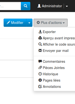
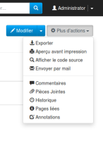
Bad location of dropdown menus when the trigger button is close to the end of the screen

    XMLWordPrintable

Details

    • Unknown
    • N/A
    • N/A

    Description

      See:

      Steps to reproduce:

      • set the language to "fr"
      • remove the right column panel
      • click on "plus d'actions"

      We can still scroll to see the end of the menus, but it's very not friendly. It's even worse on mobiles.

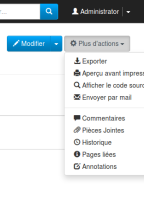
      I have reported this to bootstrap but they won't fix it. However, I have a fix.

      Note: I have already fixed this in 7.2M3, but I can improve it.
      Attachments

        1. bug.png
          bug.png
          25 kB
        2. fix.png
          fix.png
          28 kB

        Activity

          People

            gdelhumeau Guillaume Delhumeau
            gdelhumeau Guillaume Delhumeau
            Votes:
            0 Vote for this issue
            Watchers:
            1 Start watching this issue

            Dates

              Created:
              Updated:
              Resolved: