Details
-
Improvement
-
Resolution: Unresolved
-
Major
-
None
-
12.2.1
-
Unknown
-
Description
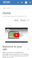
The right side of the navbar is fitting today on the screen on mobile only because of the default logo size and right menu size.
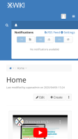
As soon as some of the menu options are used on menu (search or notifications), the display is highly improvable:
1. Search is open:

The problem in this case is the display on 3 lines of the menu, with the search passing on the left on the third line, the search box is not taking the full width of the screen to take advantage of the available space, etc.
2. Notifications are open:

The problem in this case is the passage of the menu on 3 lines. Also the search icon remains to the left of the notifications box .
Globally this looks like there is nothing that is designed specifically for mobile, these are just the same functions as on desktop and they happen to fit on the screen for the mobile.
Also, the navigation bar contains UIX (for the left navbar next to the logo as well as for the right navbar next to the search button, etc.
The current design allows for very little things to be added on these UIX or for the logo to be customized to a wider logo: as soon as this is done, there is no handling of the situation on mobile, the menus will just pass on two lines, there is no hamburger by default, etc.
The issue with the UIX is that one is supposed to put only list items in the UIX, not a full list ( https://www.xwiki.org/xwiki/bin/view/Documentation/DevGuide/ExtensionPoint/TopMenuRight ). Thus, the implicit assumption is that an UIX creator would not need to handle the container and the behaviour of this container on different screen sizes, they would just add an element in the container and XWiki would handle the container. The fact that it doesn't display right anymore after adding a couple of items is a break of this implicit promise.
Attachments
Issue Links
- is related to
-
XWIKI-17628 Dropdowns are displayed inside #xwikimainmenu
-
- Closed
-
