Details
-
Improvement
-
Resolution: Fixed
-
Major
-
12.10.6
-
Unknown
-
N/A
-
N/A
-
Awaiting Committer feedback
-
Description
The current implementation of the like button visuals on 12.10.6 (as voted here https://forum.xwiki.org/t/introducing-like-feature/7339 ) has the following characteristics:
- the color of the UI control is an active color (primary button color) when the current user hasn't liked the page and the inactive color (default button color) when the current user has already liked the page. While this makes sense from a "highlighting the most interesting action" point of view, it's completely counter-intuitive on usage, from all the other like usages in other apps, a user expects the heart to "light up" when they like a page
- there is too much information crammed in a single button: the like action as well as the number of current likes: thus, we need to have a tooltip with 2 information in the tooltip. This is really puzzling, it would be easier if the 2 purposes would be served by 2 different controls, each with its own tooltip
- the access to the list of likers is inexplicably far away from this UI and thus rather "hidden", although the actual number of likes is displayed - one needs to know that the list of likers is linked from the page content menu and go click there
- displaying the number of likes without giving an almost equally easy access to the actual likers is pushing too much for quantity over quality (it shows the number of likes and making it too hard to see whether the likers are trustworthy).
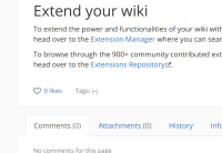
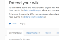
I propose the following new UI, using visuals inspired by similar features in other software:
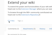
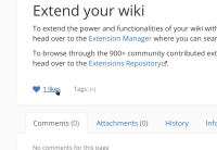
- en empty heart that fills when people like a page as the main control to like content
- followed by the number of likes that is a link to the likers
Attachments
Issue Links
- causes
-
XWIKI-24272 Likes count display broken on a page with double hyphen or dash in the name
-
- Closed
-
- depends on
-
XWIKI-21590 Add a heart_empty icon in the icon theme
-
- Closed
-
- is related to
-
XWIKI-21592 Javascript localization module shows doubled single quotes twice instead of processing them using the translation messages rules
-
- Closed
-
- relates to
-
XWIKI-20863 The like button tooltip is wrong after liking/unliking a page until the page gets reloaded
-
- Closed
-


