Details
-
Bug
-
Resolution: Unresolved
-
Major
-
None
-
15.4-rc-1
-
Unknown
-
Description
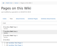
Starting with XWIKI-16140 each search result in the search suggest is wrapped in a link (anchor). This was done for improving accessibility. The problem is that most of the time a search result takes multiple lines because we're no displaying only the result title. There's also some hint and an icon. The outcome is that currently when you hover a search result you get multiple lines of text underlined which doesn't look good IMO and is not consistent with other places where we display suggestions (e.g. the page picker). Maybe I just need to get used to it but in any case we need to decide if this is the new norm or not. I would prefer to not use the underline style because this is close to a drop down menu, where each entry has an action associated, so I'm not sure that the underline style is useful.
Attachments
Issue Links
- is related to
-
XWIKI-16140 Make quick search suggestions accessible
-
- Closed
-

