Details
-
Improvement
-
Resolution: Unresolved
-
Major
-
None
-
15.10.7
-
None
-
Hard
-
Description
Definitions
- Visible output macro = there is interface space definable for it, independent of the output value
- Invisible output macro = there is NO interface space definable for it, independent of the output value
Cases
- If a macro has no output -> it will get a macro placeholder
- If a macro has invisible output -> it will get a macro placeholder
- If a macro has visible output (even if that output is blank) -> it will NOT get a macro placeholder
Issues
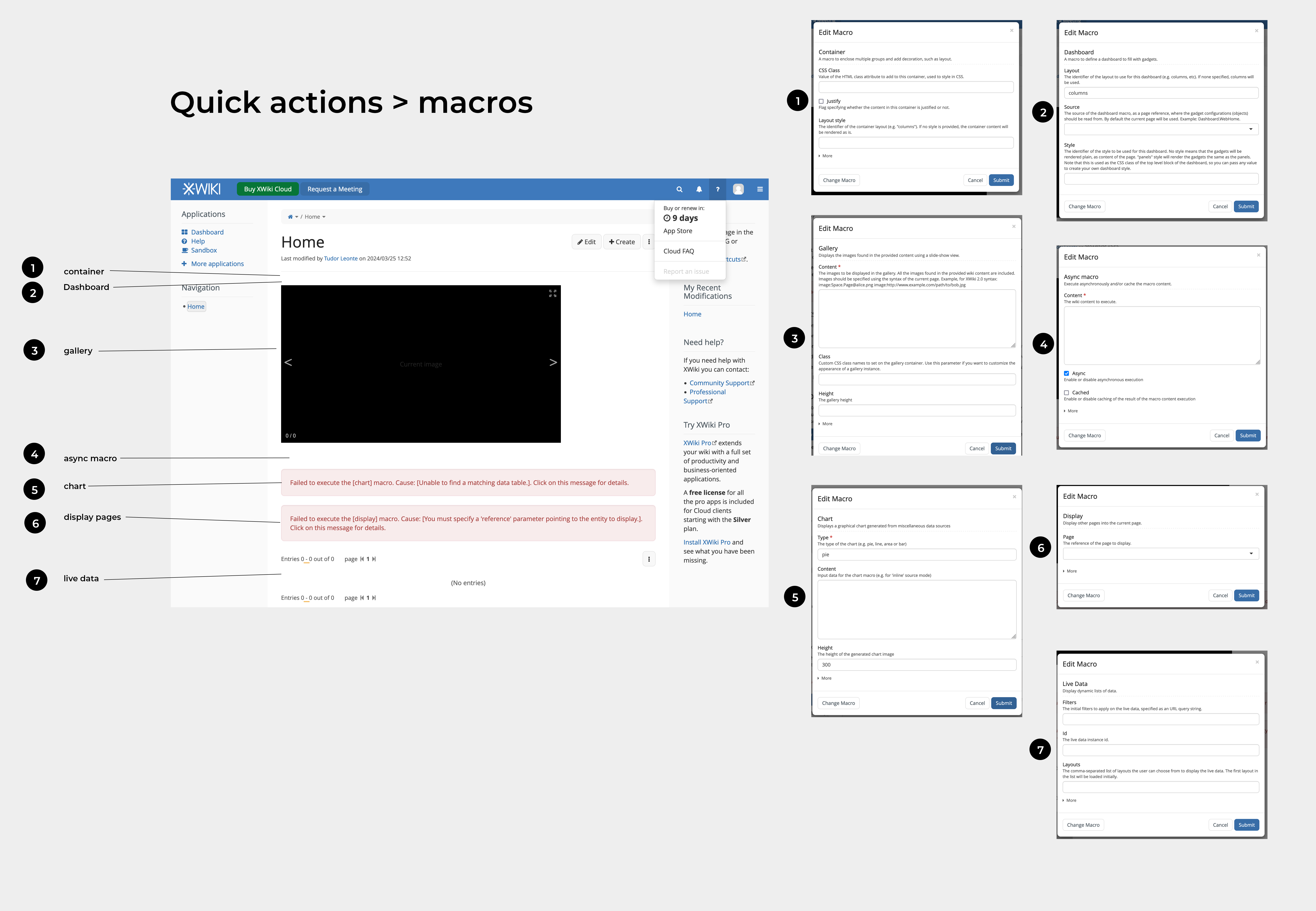
In the 3rd case, there are many macros that can be accessed through Quick Actions.
If a new user opens a visible output macro, the macro will be a blank row.
The problems with this are:
- the "blank row" feels like a bug -> user looses confidence in his abilities or in the product
- the "blank row" doesn't have any indicator for the user to understand he has to double-click on the macro to configure it
The issue persists in view mode.
Example

Context
Most of the info here is based on the discussion on #xwiki matrix chat with mflorea , iandriuta , vmassol. Added the main points of the convo in an attachement.
The blank row that appears for visible output macros with unconfigured / blank output is something configurable from the code of quick actions.
Quick actions can set predefined content/parameters for macros.
Alternative implementation of this feature (setting predefined content/parameters for macros) proposed by tmortagne :
This feature could rely on translation key naming provided by the macro, along with the parameters translations (instead of making it a quick action translation)
In other words, if there is a translation available for this macro, use it as default content.
Displaying the macro name and removing it in the same second is not a technical bug, but a bad effect of the server side rendering.
Editable inline / not editable inline
The popover menu/configuration modal is shown only for macros editable inline.
For macros editable inline, there are 2 possible actions are:
- edit the params of this macros
- insert another macro inside the current one
When the macro is not editable inline, there’s only 1 action:
- edit the macro, by double -clicking.
Solution
Not all macros should open by default in a configuration modal, as it would destroy the UX for macros like the boxes, which should be easily and directly editable once chosen by the user.
The issue probably shouldn’t be solved through the editor as you’d get a certain visual effect for all macros despite their kind of output, losing estethics.
Ideally, visible output macros that currently open in blank content should:
- open by default in non-blank state
- have by default a button to edit, delete them
- indicate they have no content in them
- indicate the name of the macro
To do this, we need to:
- define what does "blank" mean, visually & technically, to be able to formulate a rule around them
- decide on a look for the non-default state
- ensure any buttons or interactive elements are accessible
Attachments
Issue Links
- relates to
-
XWIKI-22383 Display the macro name next to the move handle when hovering a macro in the wysiwyg editor
-
- Open
-
-
XWIKI-22384 Use a different decoration for macro boundary vs. macro content boundary, for macros with content editable in the wysiwyg editor
-
- Open
-

