Details
-
Improvement
-
Resolution: Fixed
-
Major
-
8.2.1
-
None
Description
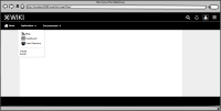
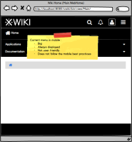
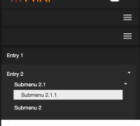
Currently, the horizontal menu in mobile is displayed right below the header (as described in the mockup Menu-Application-Mobile-Current.png). It takes a lot of space in the screen and the bigger the menu is, the less we see the content.
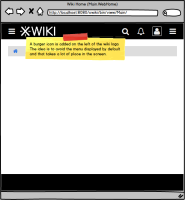
The solution that would fit the good practices of mobile navigation would be, for horizontal menu only, to display a burger icon on the left side of the header, right before the wiki logo (as described in the mockup Menu-Application-Mobile-Improvement.png).
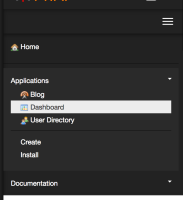
The mobile menu would work exactly as the current menu that is on the right.
Attachments
Issue Links
- relates to
-
XWIKI-14132 Menu burgers don't expand when clicked on mobile
-
- Closed
-
