Details
-
Improvement
-
Resolution: Fixed
-
Minor
-
11.4
-
Unknown
-
N/A
-
Pull Request accepted
-
Description
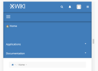
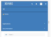
On expanded menu on mobile, it would be nice to have an X that is replacing the three lines menu button.

